Scandinavian color schemes evoke a sense of calm and serenity, characterized by their understated elegance and harmonious palettes. This design aesthetic prioritizes light, neutral tones, often incorporating natural elements to create a feeling of spaciousness and tranquility. We’ll explore the core principles of Scandinavian color palettes, delve into their variations across traditional and modern designs, and examine their practical application in various room settings.
From the subtle interplay of light and shadow to the thoughtful selection of textures and materials, Scandinavian color schemes offer a unique approach to interior design. We will uncover the psychological impact of these color choices and demonstrate how they contribute to a sense of well-being and connection with the natural world. Prepare to be inspired by the versatility and timeless appeal of this popular design style.
Defining Scandinavian Color Palettes: Scandinavian Color Scheme
Scandinavian design’s color palettes are renowned for their understated elegance and ability to create a sense of calm and spaciousness. These palettes are not merely about specific colors, but rather a thoughtful approach to light, shadow, and the interplay of hues to achieve a particular atmosphere. Understanding the principles behind these choices is key to appreciating their effectiveness.
Scandinavian color schemes prioritize a sense of serenity and functionality, reflecting the region’s long winters and appreciation for natural light. This translates into palettes that are often light, airy, and subtly nuanced, emphasizing a sense of openness and tranquility within the home.
Core Characteristics of Scandinavian Color Schemes
The core characteristics of Scandinavian color schemes revolve around a preference for muted tones and a balanced use of light and shadow. The palettes often incorporate natural elements, creating a feeling of connection to the outdoors. This is achieved through a careful selection of colors that evoke the landscapes of Scandinavia – from the pale blues of the sea to the soft greens of forests and the subtle grays of rocky coastlines. A key principle is the creation of a harmonious and balanced environment, avoiding jarring contrasts or overly saturated hues. The overall effect is one of understated sophistication and calm functionality.
Common Color Families in Scandinavian Design
The most common color families employed in Scandinavian design include various shades of white, off-white (like eggshell or linen), light grays, soft blues, muted greens, and natural wood tones. These colors work together to create a cohesive and inviting atmosphere. While bolder colors might be used as accents, they are generally employed sparingly to avoid disrupting the overall sense of calm. For instance, a deep teal might be used in a throw pillow against a backdrop of creamy white walls and light gray furniture. The focus remains on creating a soothing and balanced environment.
Light and Shadow in Scandinavian Color Choices
Light and shadow play a crucial role in Scandinavian color palettes. Given the long, dark winters, the design emphasizes maximizing natural light. Light colors, such as whites and pale grays, reflect light, making rooms appear larger and brighter. Darker colors, when used, are typically employed strategically, such as in accent pieces or to define specific areas. The interplay between light and shadow creates depth and visual interest without overwhelming the space. This thoughtful manipulation of light and shadow is crucial in achieving the desired atmosphere of spaciousness and tranquility, even in smaller spaces.
Creating Depth with Shades and Tints
Different shades and tints of a single color are often used to create depth and visual interest in Scandinavian interiors. For example, varying shades of gray might be used to create a gradient effect on walls, subtly transitioning from a lighter shade near the ceiling to a darker shade near the floor. Similarly, different tints of a pale blue might be used for walls, textiles, and accessories, creating a cohesive yet visually engaging space. This subtle variation avoids monotony while maintaining the overall sense of calm and harmony. A room might feature a light, almost-white blue on the walls, a slightly deeper blue on curtains, and a darker blue in decorative cushions, all working together to create a sense of visual depth and interest without being overwhelming.
Variations within Scandinavian Aesthetics
Scandinavian design, while rooted in a shared cultural heritage, exhibits a fascinating evolution in its approach to color palettes. Understanding these variations reveals a deeper appreciation for the nuances of this influential aesthetic. The interplay between tradition, modernity, and the ever-changing natural light significantly shapes the way color is employed in Scandinavian interiors and products.
Traditional Scandinavian design, often associated with rustic charm and functionality, utilizes a more muted palette. Think deep blues evocative of the sea, earthy greens mirroring the forests, and warm, creamy whites reminiscent of snow. Modern Scandinavian design, however, embraces a broader spectrum, incorporating bolder hues and more experimental color combinations while retaining the core principles of simplicity and functionality. This shift reflects a contemporary sensibility, allowing for more personal expression within the overall aesthetic.
The Influence of Natural Light on Scandinavian Color Selection
Natural light plays a pivotal role in shaping Scandinavian color choices. The long, dark winters and short, bright summers dictate a preference for light, reflective colors that maximize the limited daylight hours. In the darker months, lighter shades like off-whites, pale greys, and soft pastels help create a sense of spaciousness and brightness. During the summer months, when daylight extends into late evening, richer colors can be incorporated, adding warmth and depth to the spaces. This adaptability demonstrates a sensitivity to the environment and a desire to harmonize with the natural rhythms of the seasons. For instance, a home might feature a predominantly light and airy palette during winter, transitioning to warmer tones and textures as summer approaches.
The Role of Texture in Complementing Scandinavian Color Palettes
Texture is a crucial element that complements the simplicity of Scandinavian color palettes. The inherent minimalism of the color schemes is often balanced by the introduction of tactile materials such as natural wood, soft wool, and rough linen. These textural elements add depth and visual interest, preventing the palette from appearing flat or monotonous. A pale grey wall, for example, can be dramatically enhanced by the addition of a chunky knit throw or a rustic wooden coffee table. The contrast between the smooth surface and the rough texture creates a dynamic interplay, enriching the overall aesthetic experience.
Adaptation of Scandinavian Color Schemes to Different Seasons
Scandinavian color schemes are inherently adaptable to seasonal changes. The shift from the muted tones of winter to the brighter hues of summer reflects a responsiveness to the natural environment. During the winter months, the focus is on creating a warm and inviting atmosphere through the use of softer, more subdued colors. Think creamy whites, warm greys, and muted blues. As spring arrives, the palette gradually lightens, incorporating pastels and brighter shades. By summer, richer colors and bolder accents can be introduced, reflecting the vibrancy of the season. This seasonal adaptation reflects a deep respect for nature and a desire to create living spaces that are in harmony with the changing environment. A home might, for instance, transition from a predominantly grey and white palette in winter to incorporate pops of sunny yellow and sky blue during the summer.
Practical Application
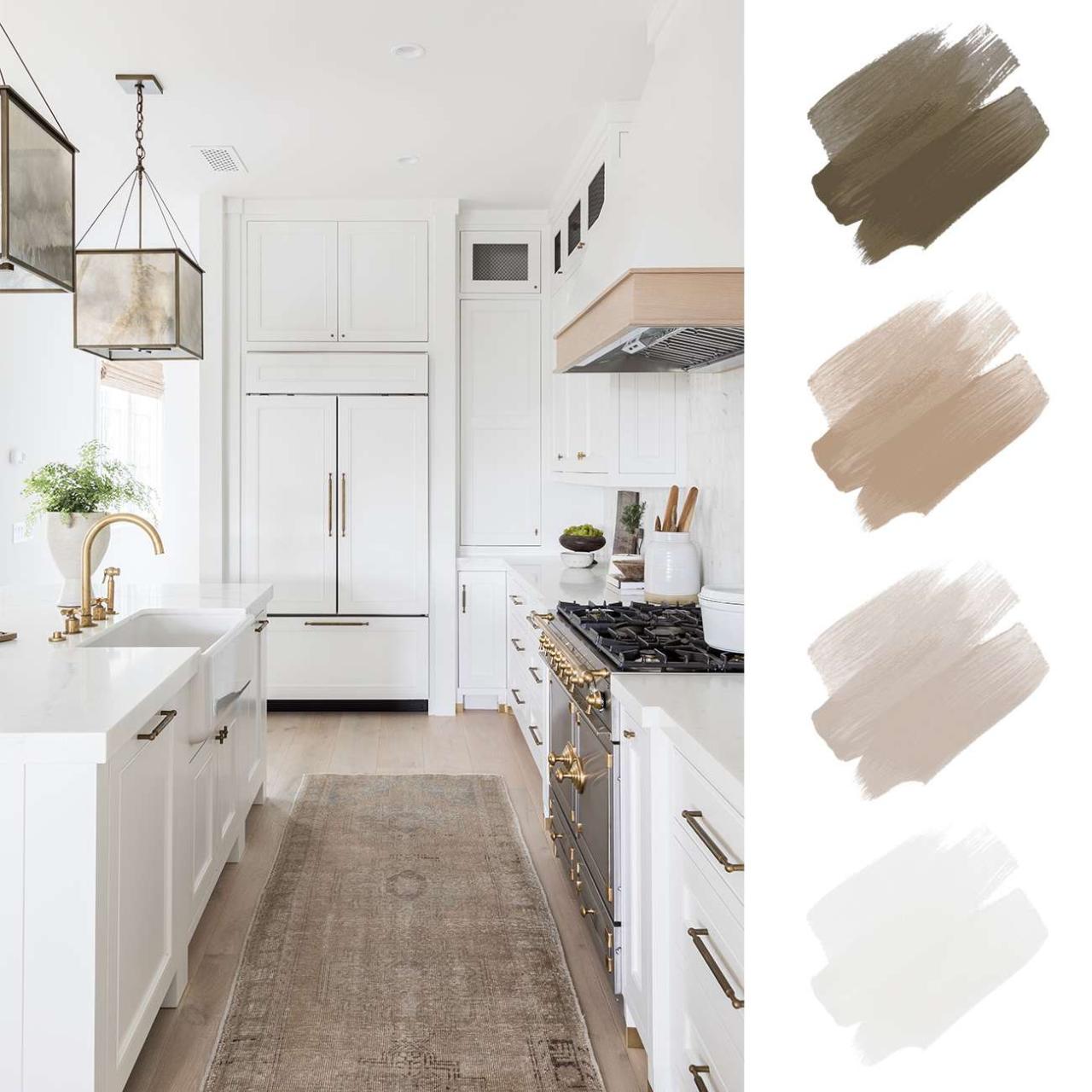
The Scandinavian design aesthetic, characterized by its minimalist approach and emphasis on natural light and materials, translates beautifully into various room designs. By thoughtfully incorporating a limited palette of calming colors and textures, one can create spaces that are both visually appealing and functionally comfortable. The following examples illustrate how a Scandinavian color scheme can be effectively applied to living rooms, bedrooms, and kitchens.
Living Room Design using a Scandinavian Color Scheme
A living room designed with a Scandinavian color scheme prioritizes a sense of spaciousness and tranquility. This is achieved through a careful selection of colors and materials that complement each other, creating a cohesive and inviting atmosphere. The following table details the color choices and material selections for a sample living room:
| Room Element | Color | Material | Notes |
|---|---|---|---|
| Walls | Warm White (e.g., “Swiss Coffee” by Benjamin Moore) | Matte paint | Creates a bright and airy feel. |
| Sofa | Light Grey (e.g., “Silver Marlin” by Sherwin-Williams) | Linen fabric | Provides a neutral base and adds texture. |
| Accessories (Throws, Cushions) | Muted blues and greens, natural beige | Wool, cotton | Adds pops of color and visual interest. |
| Floor | Natural Wood Tone | Light oak hardwood | Adds warmth and complements the overall palette. |
Bedroom Design using a Scandinavian Palette
A serene and restful atmosphere is paramount in a bedroom. The following color choices contribute to a calming and minimalist Scandinavian style.
The color palette emphasizes natural tones and soft contrasts to promote relaxation.
- Walls: Soft, warm white (“Cloud White” by Farrow & Ball) – creates a bright and airy space, reflecting natural light effectively.
- Bedding: Light grey linen sheets and a white duvet cover – provides a neutral base and adds textural interest. A few muted blue or green accent pillows can add subtle pops of color.
- Furniture: Light wood (birch or pine) nightstands and a dresser – contributes to the natural and minimalist aesthetic. The light wood complements the wall color without overwhelming the space.
- Accessories: A natural fiber rug (e.g., jute) and simple, uncluttered décor – further emphasizes the minimalist feel and introduces textural elements.
Kitchen Design using a Scandinavian Color Scheme
The Scandinavian approach in kitchen design prioritizes functionality and clean lines. A light and airy feel is maintained through the use of a neutral color palette and natural materials.
| Kitchen Element | Color | Material | Notes |
|---|---|---|---|
| Cabinets | Off-white or light grey | Matte finish wood or painted wood | Provides a clean and uncluttered look. |
| Countertops | Light grey or white | Quartz or marble | Adds a touch of elegance and durability. |
| Backsplash | White subway tiles or light wood | Ceramic or wood | Adds visual interest without being overwhelming. |
Color Psychology and Scandinavian Design
Scandinavian design’s celebrated aesthetic is deeply intertwined with its color palette’s psychological impact. The choices made aren’t arbitrary; they reflect a cultural emphasis on well-being, simplicity, and connection with nature. These carefully selected hues directly influence the mood and experience of those inhabiting Scandinavian-styled spaces.
The emotional impact of Scandinavian color choices stems from their inherent ability to create a sense of calm and tranquility. This is achieved through a thoughtful balance of light, airy colors and the strategic introduction of natural elements. The overall effect is a space that promotes relaxation and focus, fostering a sense of peace and well-being for its occupants.
The Impact of Light Colors on Spaciousness and Serenity
Light colors, particularly whites, creams, and soft grays, are cornerstones of Scandinavian design. Their reflective properties maximize natural light, creating an illusion of increased space, even in smaller rooms. This visual expansion contributes significantly to a feeling of openness and airiness. Furthermore, these light and muted tones have a calming effect on the psyche, reducing visual clutter and promoting a sense of serenity. The absence of harsh or overly saturated colors minimizes visual stimulation, allowing for a more restful and balanced atmosphere.
The Influence of Natural Elements on Scandinavian Color Schemes
The incorporation of natural materials like wood and stone significantly enhances the psychological impact of Scandinavian color palettes. The warmth of light wood tones, often found in flooring and furniture, counterbalances the coolness of the dominant light colors, creating a more balanced and inviting space. Similarly, the textural quality of stone, whether visible in a fireplace or incorporated into decorative elements, adds a grounding element that connects the interior to the natural world. This connection fosters a sense of stability and tranquility, further enhancing the overall sense of well-being.
Psychological Effects of Different Scandinavian Color Palettes, Scandinavian color scheme
The psychological effects of various Scandinavian color palettes are multifaceted and depend on the specific hues and their combinations.
- Cool palettes (whites, grays, blues): These evoke feelings of cleanliness, spaciousness, and serenity. They are often associated with calmness, productivity, and a sense of order. A predominantly blue palette, for example, might promote a sense of tranquility and peacefulness, while a gray-based scheme can convey sophistication and a sense of calm efficiency.
- Warm palettes (creams, beiges, muted yellows): These introduce a sense of warmth and coziness, creating a welcoming and inviting atmosphere. They can promote feelings of comfort and security. A cream-based palette, for instance, can feel both sophisticated and comforting, while subtle yellows can bring a touch of cheerfulness without being overwhelming.
- Nature-inspired palettes (greens, browns, muted oranges): These palettes connect the interior space to the natural world, fostering a sense of grounding and stability. They can promote relaxation and a feeling of being connected to something larger than oneself. For example, a palette incorporating muted greens and browns can evoke a sense of calm and connection with the outdoors, while touches of muted orange can add warmth and vibrancy.
Illustrative Examples
The following examples showcase how Scandinavian color palettes translate into inviting and functional spaces. The emphasis is on creating a sense of calm and serenity through thoughtful color choices, natural materials, and the strategic use of light.
Scandinavian-Inspired Bathroom
Imagine a bathroom bathed in soft, natural light. The walls are painted in a gentle, warm white, such as “Warm Nordic” by Jotun, allowing the light to reflect and create a feeling of spaciousness. The floor is covered in large, pale grey porcelain tiles, mimicking the texture of natural stone. A freestanding bathtub, crafted from white matte porcelain, sits centrally, while a dark grey, textured concrete vanity provides a subtle contrast. Small touches of natural wood, such as a shelf made from light oak, introduce warmth and visual interest. A simple, white linen shower curtain further enhances the clean, minimalist aesthetic. The interplay of light and shadow accentuates the textures of the materials, adding depth to the space without overwhelming the calming palette.
Scandinavian-Style Dining Room
This dining room is characterized by its airy feel and muted color palette. The walls are painted in a soft, muted grey-green, reminiscent of a misty Scandinavian forest. The dining table, crafted from light oak, features a simple, elegant design. The chairs, upholstered in a light grey wool fabric, provide a comfortable and inviting seating area. A simple, white pendant light hangs above the table, casting a soft glow on the scene. The overall effect is one of understated elegance and warmth. The subtle texture of the wool fabric contrasts beautifully with the smooth surface of the oak table, creating a harmonious balance. A small, textured rug in a similar grey-green hue anchors the space and adds a layer of softness underfoot.
Scandinavian Living Room with Muted Palette
Picture a living room dominated by a muted palette of greys and whites. The walls are painted in a light, cool grey, creating a sense of calm and spaciousness. Large windows allow ample natural light to flood the room, highlighting the textures of the furniture and décor. A comfortable sofa, upholstered in a light grey linen fabric, sits against one wall. A sheepskin rug, in a creamy white, adds a touch of warmth and texture to the floor. A coffee table made from light oak provides a functional centerpiece. Natural light plays a key role, illuminating the subtle variations in the grey tones and enhancing the softness of the linen and sheepskin. The overall effect is one of understated elegance and tranquility. The interplay of light and shadow creates a sense of depth and visual interest, without overwhelming the muted color scheme. The use of natural materials, such as wood and sheepskin, further enhances the calming and inviting atmosphere.
Last Point
Ultimately, the Scandinavian color scheme transcends mere aesthetics; it’s a philosophy of design that prioritizes light, space, and a connection to nature. By understanding the core principles—the use of light neutrals, the incorporation of natural materials, and the thoughtful interplay of light and shadow—you can harness the power of this design aesthetic to create spaces that are both visually stunning and emotionally resonant. Whether you’re designing a minimalist living room or a cozy bedroom, the Scandinavian approach offers a timeless and adaptable framework for creating a truly inviting and serene environment.
Scandinavian color schemes, known for their light and airy palettes, are incredibly popular for a reason. Their minimalist approach often features neutrals like whites, grays, and beiges, creating a serene atmosphere that perfectly complements the principles of Aesthetic home design. This focus on functionality and natural light makes it a strong choice for achieving a calming and stylish home, further enhancing the overall appeal of the Scandinavian color scheme.
The Scandinavian color scheme, with its emphasis on light neutrals and natural tones, is perfectly suited for creating a serene and productive atmosphere. This aesthetic aligns beautifully with the principles of a minimalist workspace setup, as exemplified in this helpful guide: Minimalist workspace setup. By incorporating these light and airy colors, you can achieve a calm and focused environment that reflects the clean lines and functionality inherent in Scandinavian design.